The five principles of a good flag
The five principles of a good flag, explained in plain words with examples: simplicity, symbolism, few colours, no lettering or seals, and being distinctive.

What makes a flag good? There is a much-quoted summary among vexillologists: the five principles of flag design that Ted Kaye set out in Good Flag, Bad Flag, a guide that the North American Vexillological Association (NAVA) published in 2006. Here they are explained in plain words, with examples.
Japan: one circle and two colours. An example of simplicity.
The short answer
- Simplicity: a child should be able to draw it from memory.
- Meaningful symbolism: what you see should mean something.
- Few colours: two or three, that contrast.
- No lettering or seals: they cannot be read from a distance.
- Distinctive: it should not be confused with another.
1. Simplicity
A flag should be easy to remember and, ideally, to draw from memory. A flag is a symbol seen waving, from a distance and in motion: fine details get lost.
2. Meaningful symbolism
The colours, images and patterns should relate to what the flag represents. A flag with arbitrary elements is harder to explain and to remember.
3. Few colours
Two or three basic colours that contrast well with each other are recommended. More colours complicate reproduction and reduce legibility.
4. No lettering or seals
Words and detailed seals cannot be read from a distance, and they appear reversed on the other side of the cloth. If an emblem is needed, it works better reduced to a simple shape. In fact, flags with a state’s seal on a plain one-colour background (called a seal on a bedsheet) tended to score lower in the survey NAVA carried out in 2001.
5. Distinctive or clearly related
A flag should stand out from the others, or look like another only if the likeness means something (for example, a historical link).
A famous survey
In 2001, NAVA ran a survey to rank the flags of all the US states and Canadian provinces. The best rated were those of New Mexico (among the states) and Quebec (among the provinces). The lowest was the one Georgia had at the time.

New Mexico: the top rated among the states.

Quebec: the top rated among the provinces.
The rules are not laws
The guide Guiding Principles of Flag Design, published by the Flag Institute and NAVA, makes two things clear. First, it does not deal with aesthetic appeal, because that depends on culture and on each person. Second, there are “many successful rule-breakers”, such as the flag of South Africa or the Pride flag, which use many colours and work.
The principles therefore serve as a starting point for judging a design, not as a pass-or-fail exam.
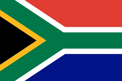
South Africa: many colours, and it works.

The Pride flag, another that breaks the colour rule.