Skip to content

Wiki Banderas
Open menu

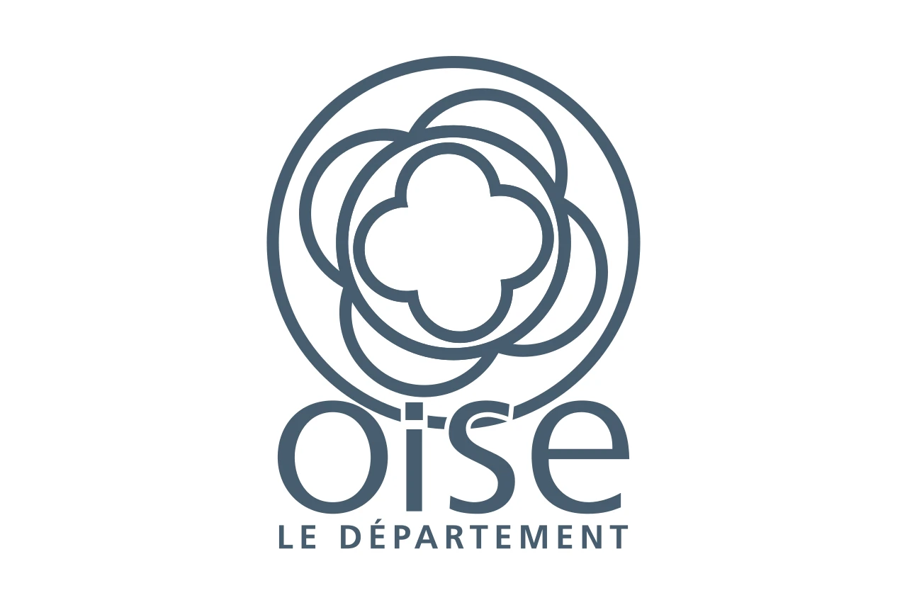
Flag of the department of Oise

White, with the greyish blue logo of the department of Oise: a four-lobed flower inside circles. It is an institutional flag.

Flag of the department of Oise
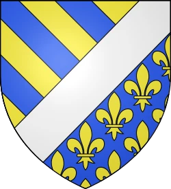
Coat of arms

The flag, in figures

Every fact about the flag, each with what it means.

Proportions
2:33 wide for every 2 high. 989 flags in the catalogue share it.
Properties
Normal flagFIAV symbol: the form of the flag.
Use
CivilFIAV symbol: who may fly the flag.
Colours
  • white
  • greyish blue
Reference shades: the official one may vary slightly.
Coat of arms
YesIt carries the coat of arms on the cloth.
12

Take a closer look

  1. The white cloth

  2. 1

    The logo

  3. 2

    The four-lobed flower

How it is described

The flag in the words of vexillology and heraldry.

Vexillological description

It is a rectangular field with a 2:3 ratio, white and plain. In the centre it bears the logo of the departmental council, drawn entirely in greyish blue.

Field (the cloth)
white, with no divisions.
Logo
a quatrefoil, a four-lobed flower, inside circles.
Text
“oise” and “Le département”, below the drawing.
Colours
white and blue.

What it carries

Each element and how many of the 1,390 flags in the catalogue carry it. In yellow, the rarest.

The full story

How it was born, how it has changed and what it means.

The flag of Oise is a white field, with the logo of the department in the centre. It carries no arms and no coat of arms.

How it came about

Oise is a department of France. Its flag is not a blazon: it is a field with the graphic mark the institution uses as its identity.

How it has changed

No approval date is recorded. These are recent flags, tied to the institutional branding of the departmental councils.

What it means

  • Ground

    white.

  • Logo

    the graphic mark of the departmental council.

  • No coat of arms

    there are no arms, no crown and no crest.

Fun facts

  1. A quatrefoil inside circles

    The logo is a four-lobed flower enclosed in circles. The floral shape is used here as a mark, not as an emblem: it is in a circle, not in a coat of arms.

  2. The name in lower case

    The logo writes “oise” entirely in lower case, without a capital O. It is the way of writing the river, and it contrasts with the capital that the department does use in its traditional coat of arms.

  3. All in one colour

    The drawing is in greyish blue on white. It is the most monochrome logo in the collection: not a second ink, not a colour accent.

Localisation

How much have you learnt?

Test what you have read about the flag of Department of Oise.

  1. 1. Which one is the flag of Department of Oise?

  2. 2. Which of these elements appears on the flag?

  3. 3. What are the proportions (height:width) of the flag?

Sources

Sources consulted:

Credits

Flag image: Germenfer, Wikimedia Commons · CC0.

More flags

Accessibility preferences

Accessibility statement

Quick profiles

Text and reading

Text size
Default
Line height
Default
Letter spacing
Default
Word spacing
Default

Colour

Motion and orientation

Cursor